
A redesign is expensive. It's also not always the answer.
A UX audit is cheaper, faster, and often reveals that your biggest conversion problems have nothing to do with "the design." They're unclear messaging, broken journeys, avoidable friction, and missing trust signals. Things you can fix without tearing everything down and starting again.
Here's a simple audit process you can run in days, not months.
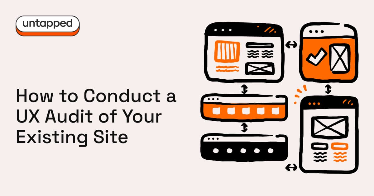
What a UX audit actually is
A UX audit is a structured review of how your site performs for real people. It looks at user journeys, known UX principles (heuristics), your data (analytics, session recordings, support tickets) and the basics of accessibility and performance.
It's not a subjective design critique. It's a prioritised plan to improve outcomes.
Step 1: Define the goal (one sentence)
Pick one primary outcome. That might be lead form submissions, demo bookings, purchases, quote requests, or email sign-ups. Whatever it is, define success as a measurable conversion event.
If your goal is vague, your audit will be vague.
Step 2: Map your key journeys
You don't need to map every possible path through your site. Three is enough.
For most businesses, start with these: the first-time visitor who needs to understand your offer and take a next step; the returning visitor who's comparing options and ready to convert; and the high-intent visitor who's looking for proof before contacting sales.
Write the steps on one page. Then try to complete each journey on mobile. You'll learn more in ten minutes than you'd expect.
Step 3: Run a heuristic review
This is the fast, brutal, useful bit. Work through your key pages and ask yourself five questions.
Can users understand what you do within ten seconds? Can they find what they need without guessing? Are next steps obvious and consistent? Are your forms frictionless, and do they explain what happens after someone hits submit? And what happens when things go wrong?
For every issue you find, capture what the problem is, where it happens, why it matters, and a suggested fix. Keep it tight.
Step 4: Run an accessibility quick scan
You don't need a full compliance programme to spot the major blockers. Check your contrast and readability. Try tabbing through the site with just your keyboard. Look at your heading structure, image alt text, and whether your form labels and error messages actually make sense.
Accessibility isn't just legal hygiene. It's conversion hygiene. If people can't use your site, they won't convert on it.
Step 5: Review your content and SEO structure
This is where a lot of sites quietly bleed traffic. Look for outdated pages, thin or duplicated content, and missing proof: testimonials, case studies, results. Check whether your positioning is clear: who is this for, and why should they choose you?
Then make sure your pages have meaningful titles, meta descriptions, and headings that match what people are actually searching for.
Step 6: Check performance and technical health
At minimum, look at page speed on mobile, image weight, broken links, missing HTTPS, 404s, and redirect chains.
Speed isn't a nice-to-have. It shapes bounce rates, trust, and search rankings. If your site is slow, nothing else you fix will matter as much as it should.
Step 7: Validate with five quick user tests
You can do this informally. Give five people a task: "Find out what this company does," "Try to request a quote," "Try to compare options." Then watch where they hesitate.
Hesitation is where conversion dies. These ten-minute tests will tell you more about your site's real problems than any internal review ever will.
Step 8: Prioritise with impact vs effort
Sort your findings into three buckets: quick wins you can ship in a day or two, mid-effort fixes that take a week or two, and strategic changes like restructuring, repositioning, or redesign work.
Then build a 30-60-90 day plan. This gives you momentum early and keeps the bigger work on track.
What you'll walk away with
A prioritised issues list, a conversion-focused roadmap, suggested page structure improvements, copy and CTA recommendations, and a measurement plan with the events and funnels to track progress.
Do this well, and redesign becomes a choice, not a panic response.


Any thoughts?
Leave a comment