Your product should feel effortless, not confusing. We plan the journey first, then design the interface so every screen, state and message earns its place. Expect thoughtful flows and clean systems shaped by user-experience planning. We craft visuals that scale elegantly across devices with modern graphic design, and we bake in accessibility from day one so more people can use your product.
User Experience & Graphic Design defines direction and ensures delivery by answering, “Who are we serving, what do they need at each step, and how do we remove friction so they convert and return? The result is clear journeys, consistent UI, and a repeatable system that supports growth, release after release.
Why It Matters
UX planning and modern interface design remove friction, increase conversions, and make delivery faster and safer.
Clarity & Conversion
Clear journeys and well-structured content guide users to take action. When tasks are easy to start, understand and complete, conversion rates rise.
Speed & Consistency
Design systems (tokens, components, patterns) create a shared language across teams. You ship faster, avoid rework, and keep quality consistent.
Accessibility & Reach
Inclusive, standards-aligned design opens the door to more users, reduces support costs, and protects brand reputation and compliance.
Mobile & Performance
Responsive layouts, scalable type, and optimised assets deliver crisp, fast experiences on every screen size, improving engagement and SEO signals.
Evidence Over Assumption
Prototyping and targeted tests validate flows before build. You invest in what works, not what looks good on a static board.
Delivery Without Drama
Clear specs, acceptance criteria, and decision logs keep design, content, and engineering aligned so features move from Figma to prod smoothly.
Our UX & Design Process
A collaborative, data-first path that balances clarity with craft.
Step One
Discovery & Audit
Stakeholder interviews, analytics review, competitor patterns, and heuristics. Define goals, audiences, constraints, KPIs and risks.
Step Two
Journeys & Structure
User stories, top tasks and decision points. Draft IA (information architecture), user flows, and wireframes to confirm content and layout before any high-fi work.
Step Three
Design System Foundations
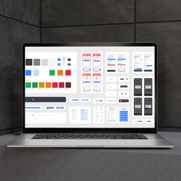
Design systems and component libraries built for scale, paired with a full UI Kit of reusable elements, styles, and interaction patterns. Everything needed to build fast, stay consistent, and ship without friction.
Step Four
High-Fidelity UI
Apply the system to priority screens and states, including empty, error and loading. Write microcopy, specify motion, and prepare content models.
Step Five
Accessibility Reviews
Contrast, focus, keyboard and screen-reader checks, form patterns, media alternatives. Capture acceptance criteria for engineering.
Step Six
Prototype & Validate
Clickable prototypes with targeted user walkthroughs. Capture findings, prioritise fixes, and tune flows for conversion and comprehension.
Step Seven
Handover & Support
Dev-ready Figma files, redlines and tokens component library usage docs. Optional design QA during build and post-launch optimisation sprints.
Case Studies


Tailored for Startups and Enterprises
User experience isn’t one-size-fits-all. We adapt scope, pace and governance to your stage, applying research-led planning, design systems, and accessibility-first standards so what you ship is clear, consistent, and inclusive.
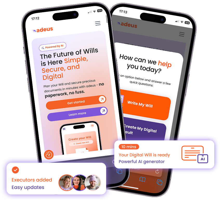
For startups, the focus is speed and impact. We prioritise the essential core user journeys, lean information architecture, and wireframes, plus a responsive UI starter and accessible patterns to get you launch-ready quickly. Systems are built to scale with you, so the product feels clear from day one without wasted time or complexity.
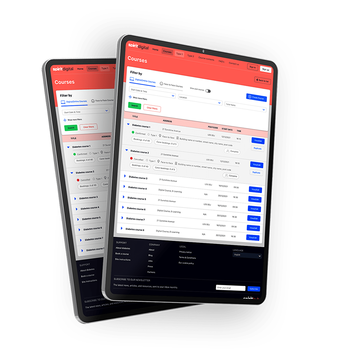
For enterprises, the focus is on alignment and consistency. We engage stakeholders, refine product architecture and workflows, and deliver a governance-ready design system with detailed specs and templates, including WCAG-aligned criteria. The result is a robust UX foundation that minimises risk, supports multiple product lines, and ensures seamless implementation across teams, regions and channels.
What You Get
At the end of an Untapped UX/UI project, you’ll have a complete set of user-focused interface designs, interaction patterns, and usability guidelines that form the foundation for every digital experience you create.
Experience Architecture Pack
Goals, audiences, top tasks, and success metrics, information architecture, navigation models, sitemaps, and content hierarchy. Decision points mapped for happy paths and recovery paths.
Wireframes & Flow Library
Low-fidelity screens that lock the structure before polish. Flow diagrams for key tasks, edge cases, empty states, and error states, so nothing is missed in the build phase.
Design System Foundations
Design tokens (colour ramps, contrast rules, type scales, spacing, motion primitives), core components (buttons, forms, tables, modals, toasts) and usage guidelines that make work repeatable.
High-Fidelity UI Screens
Priority screens across breakpoints with variants for loading, error, success, and interactive states. Motion specs and micro-interaction notes aid clarity.
UI Kit
A complete library of reusable components, styles, and interaction patterns ready to plug into design and development. Built for speed and consistency, it gives your teams the tools to ship new features faster without sacrificing quality.
Content & Microcopy Kit
Voice and tone guidance, interface copy patterns, form labels, validation and error messages, and empty-state frameworks that help users progress.
Accessibility Pack
WCAG-aligned colour/contrast, focus and keyboard paths, ARIA where useful, screen-reader cues, target sizes, media alternatives, and motion-sensitivity guidance. Findings report with prioritised fixes.
Prototype & Validation Report
Clickable prototypes for core journeys test plan, participant notes, observed issues, severity ratings, and recommended changes rolled back into the system.
Developer Handover Bundle
Dev-ready Figma organised pages, component variants, constraints, redlines, and export settings. Token files and acceptance criteria to keep parity in code.
Instrumentation & Metrics Map
Events and states to track (e.g., enquiry, signup, activation, completion), suggested dashboards, and baseline UX metrics so improvements are measurable.
Governance & Runbooks
Library management, contribution model, naming conventions, and review checklists (design, accessibility, performance) to keep the system healthy as it scales.
Training & Live Walkthroughs
Recorded handovers, Q&A sessions, and admin guides so product, design, and engineering teams can run independently.
Post-Launch Options
Design QA during build, ongoing optimisation sprints, system hardening (theming, tokens), content design support, and performance passes extend only if they serve ROI.
Together, these deliverables give you everything to design and include a coherent system, accessible patterns, and build-ready specs. We can add extras to suit your business needs, but this set forms the core foundation for success.
Ready to Design Experiences People Love?
We turn ideas into intuitive, minimal-click user journeys, responsive interfaces, and accessible designs that feel effortless and on-brand on every screen.
Whether over a virtual coffee or in person, we’ll map the fastest route from concept to clickable product.
FAQs
1. How long does this take?
It really varies on your project. Some can last 2-3 weeks for small UX enhancements to a specific feature, or 12+ weeks for a large scale project.
2. Can you work with our existing brand or dev stack?
Yes. We extend existing guidelines and align component specs with your front-end framework.
3. Do we own the outputs?
You do. You’ll receive Figma files, component libraries, documentation and any templates we create.
4. Will this help SEO and performance?
Good UX improves discoverability and conversion rate. Our patterns support fast, accessible pages and clear information architecture.
5. What happens after handover?
We can stay on for design QA during build, accessibility checks, and optimisation sprints or hand over cleanly with training.


